I had the opportunity to create multiple spreads for a book that was based on the color red. It was interesting to learn the many different qualities of red and the myriad of objects that are made of it. Throughout this post is the process that I took in order to achieve the final results.
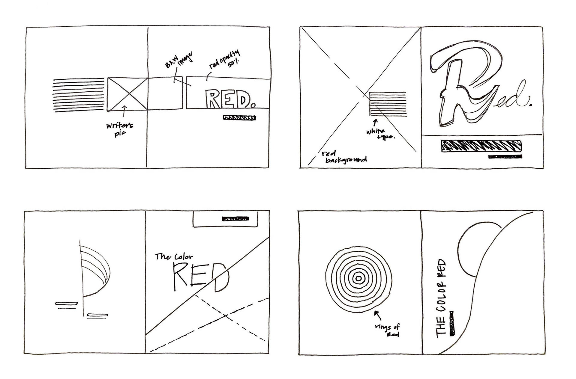

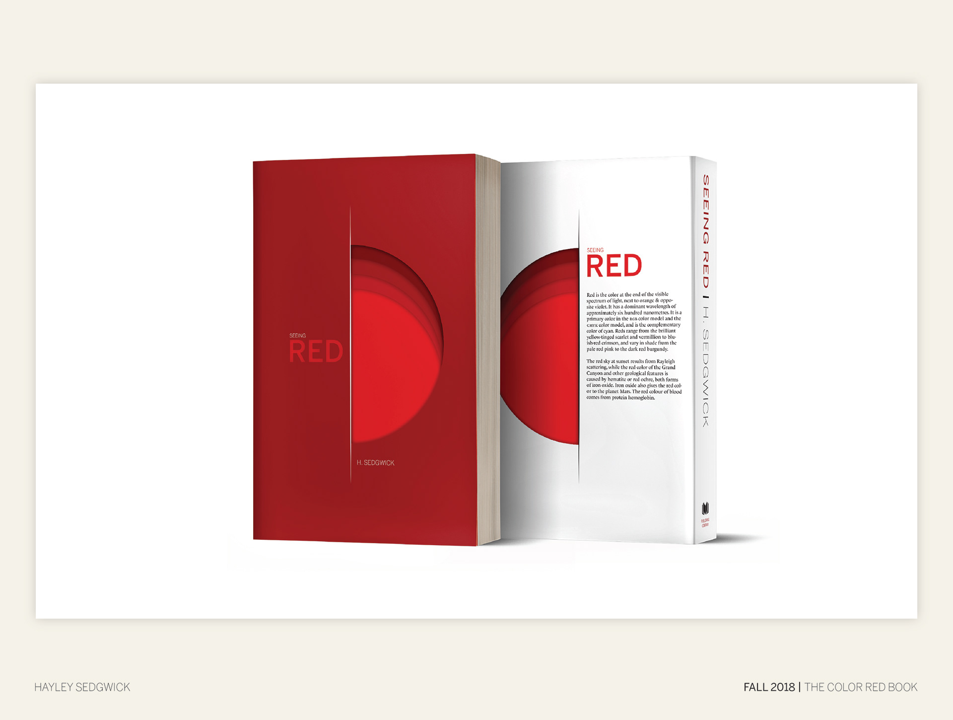
For the cover, I knew that I really wanted to emphasize the color red. I tried multiple variations in which I experimented with red type and images. I liked the idea of using simple shapes, and eventually arrived at my final design.
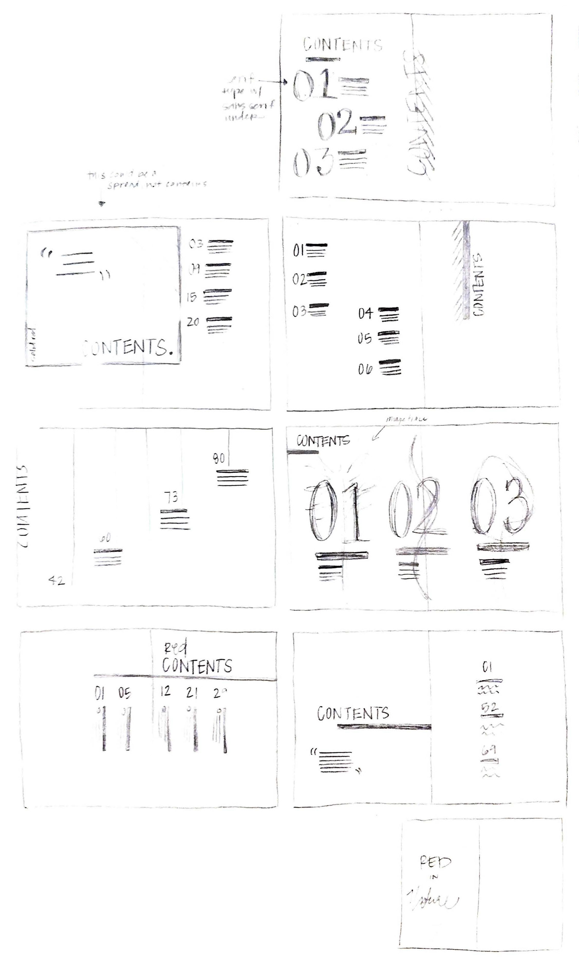
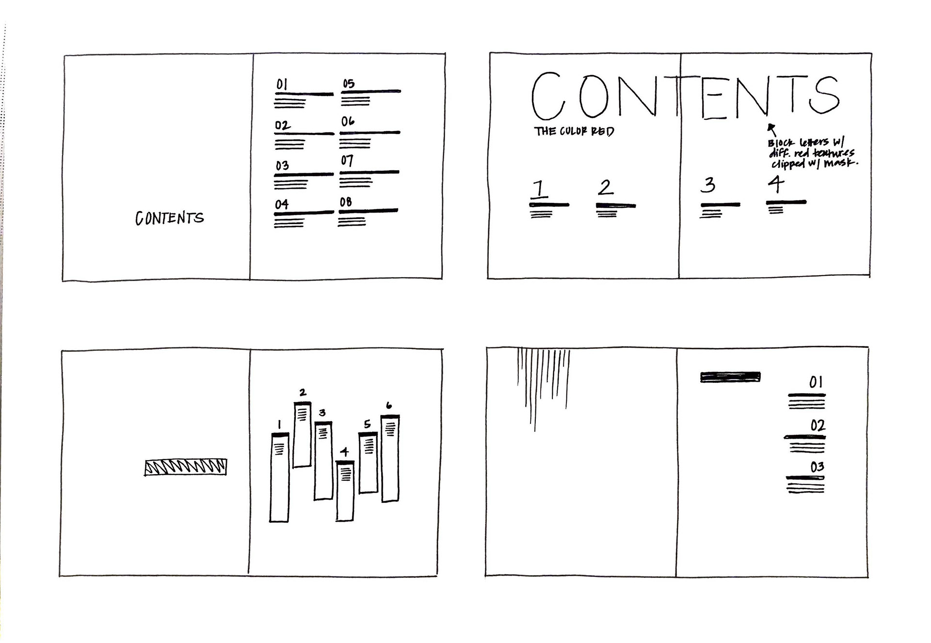

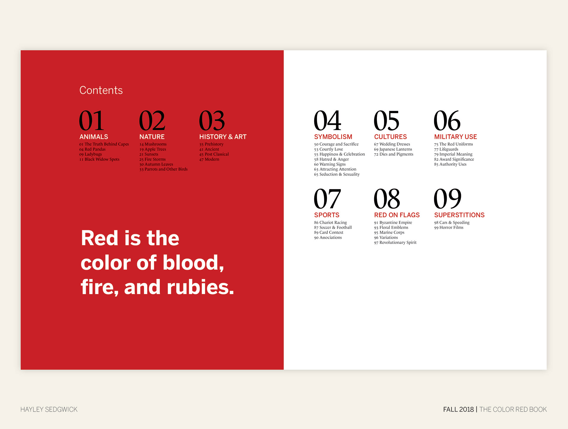
I really wanted to emphasize the grid with the contents page. I experimented with different layouts and was really drawn to large numbers and pull quotes.
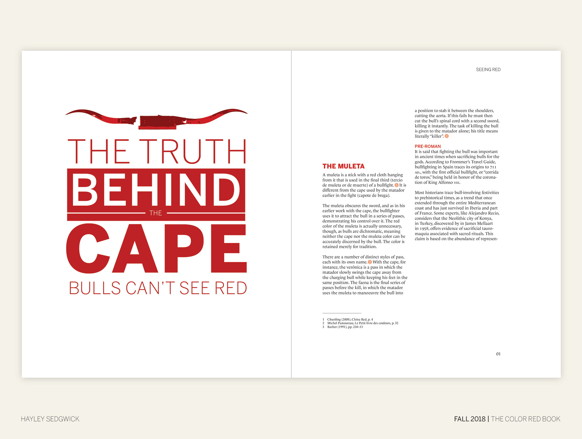
For the various spreads of my book, I worked with margins and a grid in order to add an element of cohesion and unity. Text hierarchy played an important role in these spreads as well.


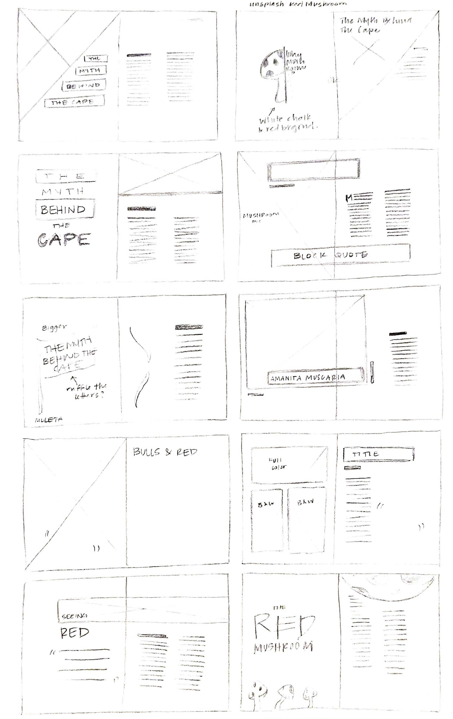

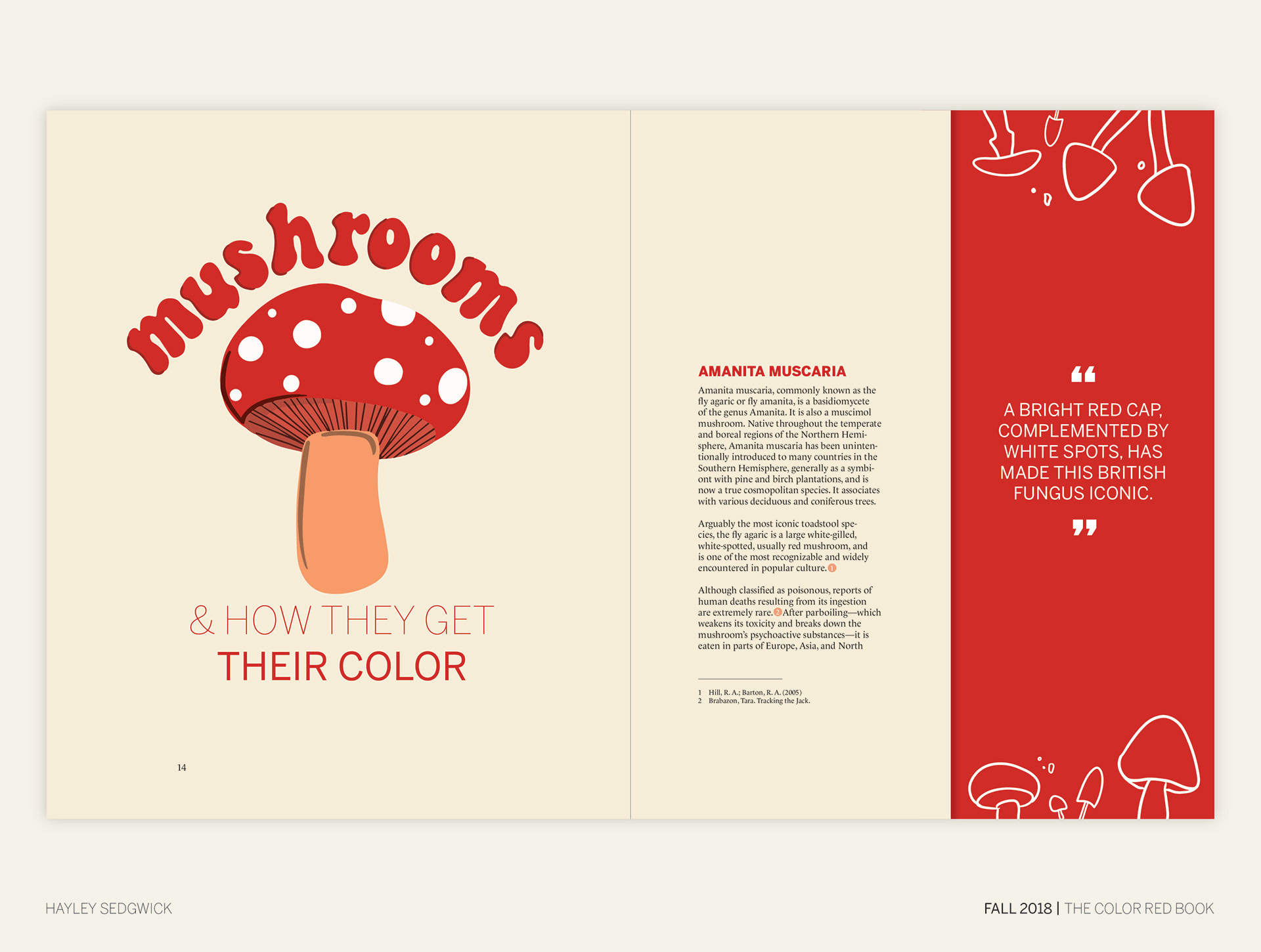
I wanted the title to be the focal point of this spread, as it would indicate what the article was about and an interesting fact about it.


I knew that I wanted to add an illustration element to this spread and so I did so with the different mushroom drawings. I used a more flowy element for the title in order to add to this illustration style.
I really enjoyed this project and figuring out different ways to display the color red. I was able to experiment with different type textures and elements that allowed me to create a fun and united design.