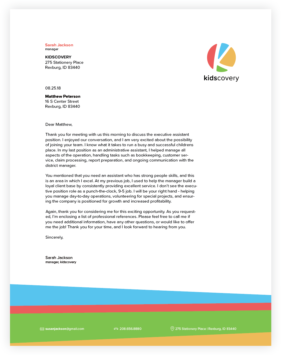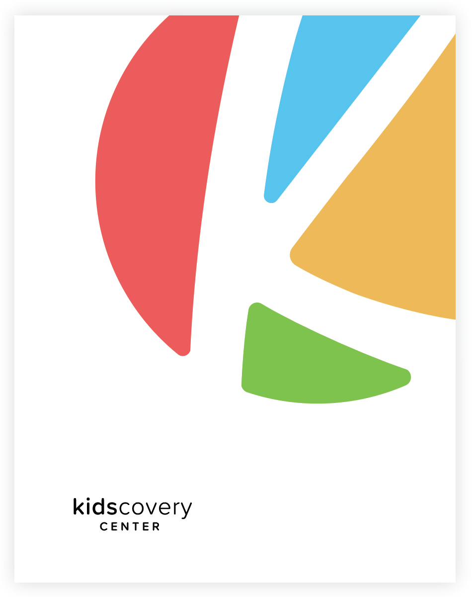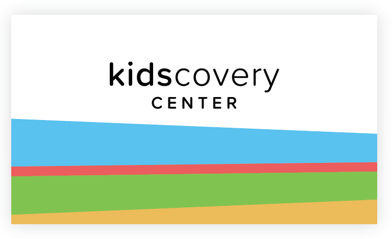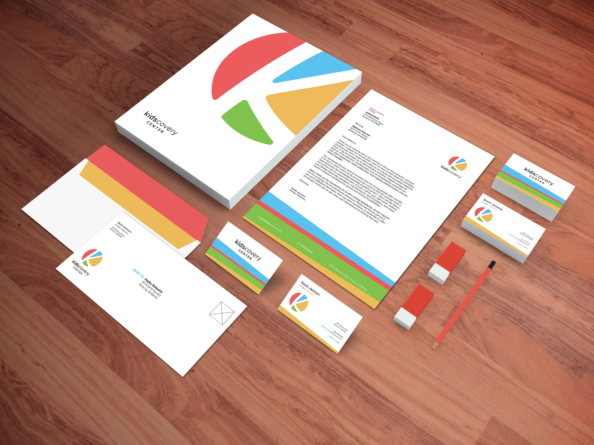
For this project, I was asked to create a brand for a children's discovery center. This is the stationary that I designed. I used a sans serif font with rounded edges to create a clean look that would appeal to both children and their parents. This also reflected the curved lines of the "K" in the logo. For this brand, I also created a texture or pattern with the horizontal colored lines in order to draw the brand together with the logo I developed. I used primary colors in order to play off of the general colors associated with children and learning.